Designing a device where a
misunderstanding is a clinical risk
Research · interaction design · usability testing · design system · documentation
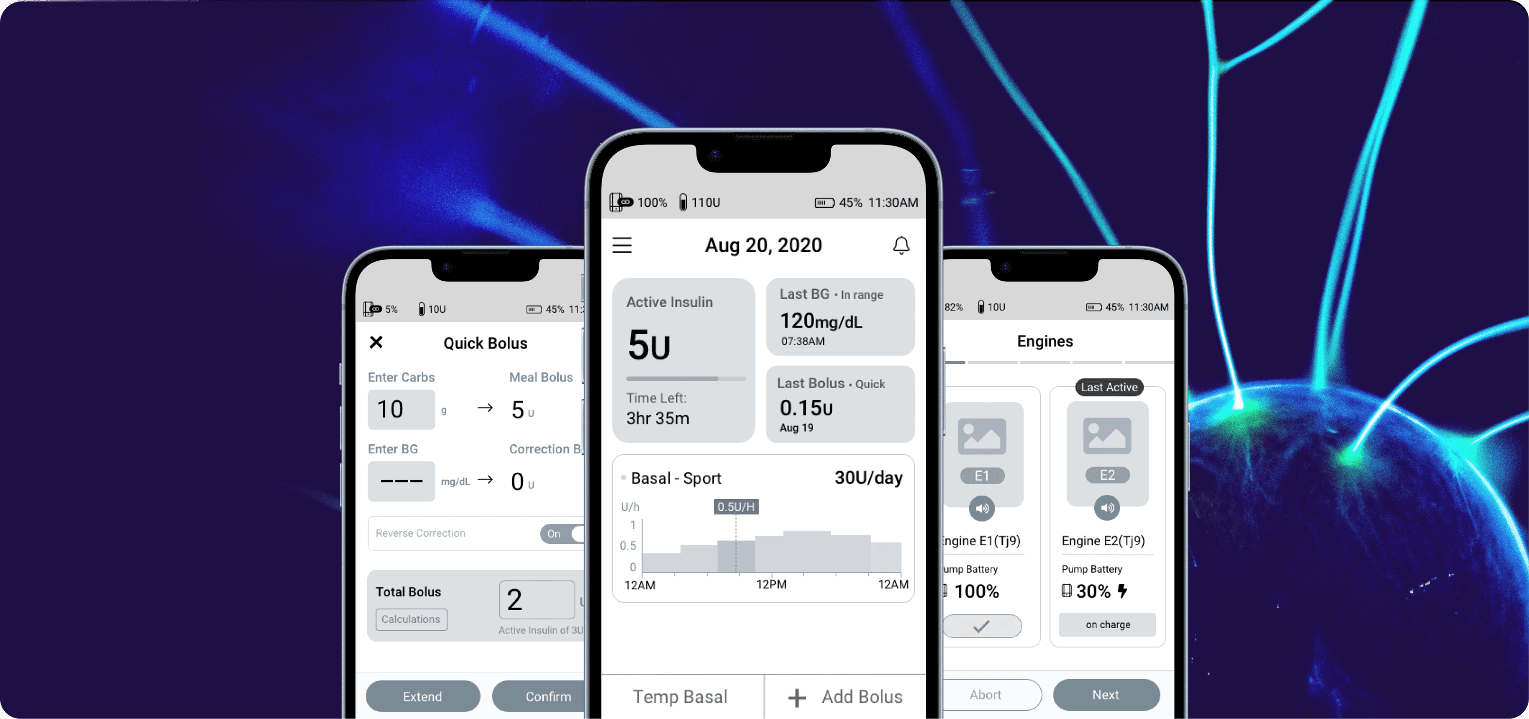
Product
Mobile software for managing continuous insulin delivery.
Role
Led research, interaction design, formative testing and delivery documentation for the new controller.
Timeline
15 months on the new controller for FDA submission, followed by 7–8 months contributing to established insulin-pump products after the acquisition.
Team
Cross-functional partner across Human Factors, Product, Engineering, QA, Risk & Compliance, and Testing
Problem
The controller supported insulin delivery, dose entry, alarms, pump replacement and recovery. A confusing interaction could contribute to a use error and potentially affect patient safety.
Approach
I learned the domain, mapped the workflows, then tested realistic scenarios with users to see where tasks broke down. The findings became the flows, the interaction rules, the error states and the documentation the team built from.
Outcome
The work identified foreseeable use errors early, informed changes to critical workflows and gave design, engineering and testing one shared implementation reference. The controller later progressed into further user and clinical studies and received positive feedback from the target audience.
4
discovery interviews
3
formative test rounds
8
participants in the reported round
How the project progressed
Existing clinical and product evidence → domain learning and competitive research → user interviews → information architecture and wireframes → formative usability testing → iterative UI design → further testing → implementation documentation and multidisciplinary review.
01 understand
What did we need to learn first?
Clinical and technical evidence defined what the controller had to do, but it did not explain how people fitted insulin management into daily life. I reviewed the existing evidence and competitor products, then interviewed four experienced pump users before defining the information architecture.
Research question
What information and functions do experienced pump users depend on during everyday insulin management?
Why this approach?
Existing evidence defined the clinical and technical boundaries. Competitor research revealed familiar patterns and unresolved problems. Interviews added users’ routines, priorities and language.
How the findings shaped the product
I used these findings to shape the information architecture, navigation priorities and the scenarios used in formative testing. The proposed structure was then reviewed with the wider team.
What the interviews helped us understand
The interviews showed what people checked first, which actions they used most often, what they expected to find in treatment history and which terms already felt familiar.

Information architecture
What do you check first after waking up?
Measure BG and calibrate the sensor
How often do you check your blood glucose?
2–10 times per day
Which bolus types do you actually use?
60% quick · 30% dual · 10% long
02 test
Where could foreseeable use errors occur?
The controller was being developed within an IEC 62366-informed human-factors process for FDA submission. Before formal validation, we needed evidence that representative users could complete critical setup and treatment tasks safely and understand where the design still required improvement.
Research question
Where could users skip a required step, misunderstand the system or take an unintended action?
Why scenario-based testing?
Participants completed realistic setup and treatment scenarios using the prototype. This allowed us to observe behaviour rather than rely on opinions or self-report and to improve the design before formal human-factors validation.
Scenarios covered: initial setup, basal-profile editing, bolus delivery, suspension and pump switching.
How we analysed the sessions
Each task was classified as success, success with difficulty or failure. We documented what happened, investigated the likely cause and considered the potential consequence and whether the interface supported recovery.
3
testing rounds
8
participants
2/8
failed pump attachment
1/8
failed to suspend
Finding 01 · Pump attachment
Users did not reliably follow the activation sequence
What happened
Two of eight participants failed; two more completed the task only with difficulty.
Why it happened
The current pump state and required next action were not explicit enough.
Interpretation
We revised the sequence, instructions and feedback so the safest next action was clearer and missed steps were less likely.
The trade-off
Adding more guidance increased the amount of information on screen, but testing showed that explicit device-state feedback was more important than visual minimalism in this workflow.

instructions and feedback we revised after testing
Finding 02 · Treatment safety
Unsupported BG values could not continue into dose calculation
risk
An out-of-range reading could be unreliable or require immediate attention.
What we decided
Label it HIGH or LOW, keep it out of the bolus calculation and require a supported reading before continuing.
Why it mattered
This prevented uncertain information from being used to calculate insulin and clearly showed the user what to do next.
The trade-off
Blocking the reading added friction to the dosing workflow. Allowing uncertain input to continue created a greater safety risk, so we prioritised prevention and made the recovery path explicit.
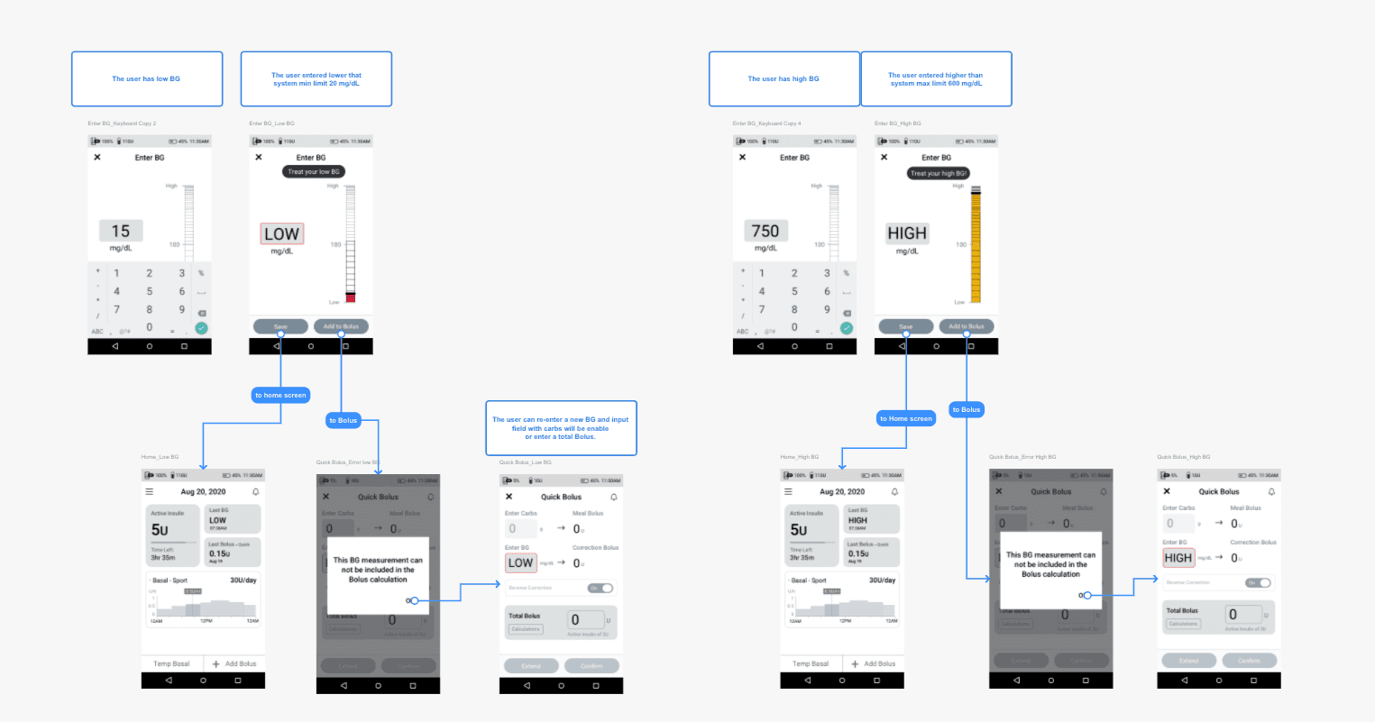
Enter BG flow
03 deliver
How I carried the evidence into delivery
I turned the findings into detailed workflows, interface states, terminology and reusable patterns. These became the shared reference for the team, and the UI Design Document formed part of the Design History File.

UI Design Document

What I personally owned
Planned and conducted discovery interviews
Facilitated multidisciplinary workshops to align the team
Turned findings into architecture, scenarios and prototypes
Ran formative usability testing and analysed failures, difficulties and likely use errors
Revised workflows and interaction behaviour
Led UI delivery, interface strings, design-system work and documentation

Critical semantic tokens applied to a reusable alert pattern
04 outcome
What changed because of the research?
For this controller, progress wasn't measured in conversion or retention. What mattered was whether testing exposed foreseeable use errors, and whether the resulting design could be implemented, tested and reviewed as part of the FDA-submission programme.
Patient-safety impact
We found issues in pump attachment, treatment settings and blood-glucose entry. The team changed these areas before formal validation.
Product impact
The controller progressed into further user and clinical studies and received positive feedback from the target audience.
Delivery impact
The interaction model, design system and UI Design Document gave design, engineering and testing one shared reference for implementation.
What I learned
This was my first medical-device project, and at the beginning I found it difficult. I had to understand the clinical side, hardware, software and safety process at the same time. It changed the way I think about usability. I started paying more attention to uncertainty, stress and what happens when something goes wrong.
What stayed with me
Speaking with people living with Type 1 diabetes made the effect of small interaction decisions feel real. The controller was only one part of their daily treatment, but it could either add to that burden or make it a little easier. With more time, I would have involved a broader mix of users earlier.
Client name withheld. The shipped interface remains confidential; selected wireframes, research evidence and system artefacts are shown instead.